Media Queries in CSS
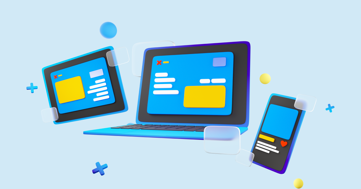
Hi there👋, today i’ll explain how to make your website responsive using CSS media queries, so users can have good browsing experience in different devices
Media queries are used to conditionally apply CSS based on the devices width and height, now let’s understand the syntax of the media queries, we need to use the @media property with width or height condition
Here is an example: @media (condition), now let’s see a proper example👇
/* here i've specified the condition as min-width: 1024px */
/* the css will apply if the device width is greater than 1024px */
@media (min-width: 1024px) {
  .box {
    background-color: yellow;
  }
}

/* similarly there is opposite of min-width which is max-width */
/* the css will apply if the device width is less than 1024px */
@media (max-width: 1024px) {
  .box {
    background-color: yellow;
  }
}
Let’s understand with a sandbox example, let’s create a square box(🟥) and change it’s color based on the device width
<!-- I'll create a div which is in square shape -->
<div class="box"></div>
/* I did some basic styling */
/* Initially the color of the box will be red */
.box {
height: 10rem;
width: 10rem;
background-color: red;
}
/* If the device width is greater than 768px, the box color will change to blue color */
/* I took color as an example, you can use the all css properties here */
@media (min-width: 768px) {
.box {
background-color: blue;
}
}You can use the combination of min-width and max-width and target a set of screen width, here is an example👇
/* this will apply the CSS overrides devices with width between 768px - 1024px */
@media (min-width: 768px) and (max-width: 1024px) {
  /* your CSS overrides */
}
For more examples you can check MDN Docs
Bonus
- While developing a website target smaller devices first phone -> tablet -> laptop -> desktop this will make your website look good in most of the cases
- I use these breakpoints for media queries,
- 365px (Phone)
- 768px (Tablet)
- 1024px, 1280px (Laptop)
- 1920px (Desktop)
And that’s it for this blog, thanks for making it till here, stay tuned for more updates peace✌️