CSS Flex and Grid
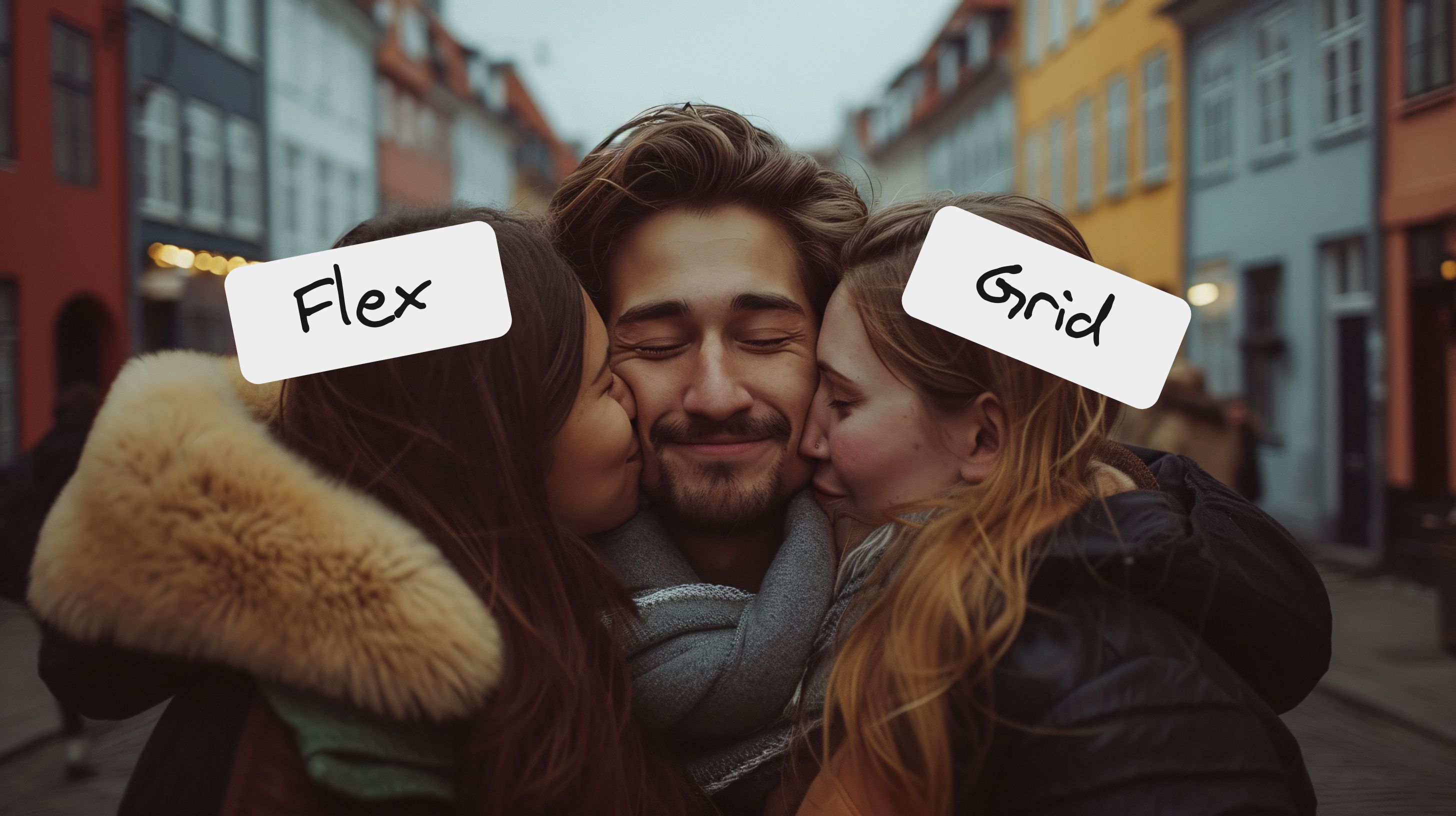
Hi there👋, i’ll explain the CSS Flex and Grid, these are tools for building layout in CSS, we can build same layout using both these properties, some cases flex shines for other cases grid shines. I’ll explain both of them with sandbox examples, so you can try-out how they work!
Grid
Grid can be very helpful when you’re trying to place elements in equal spacing & create a uniform layout
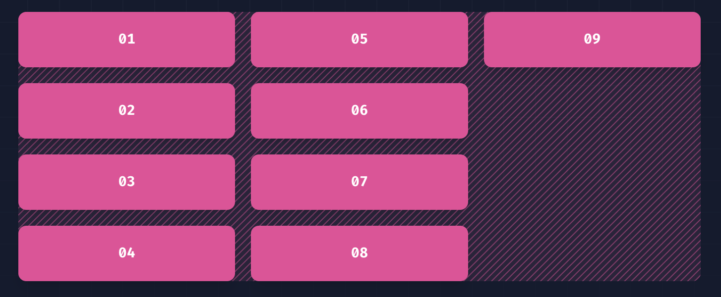
And you can even build complex layouts like bento grid
Now let’s understand grid with an example, i’ll create a container div with some elements👇
<!-- This will be our grid container -->
<div class="container">
  <!-- These are our individual elements -->
  <div class="item"></div>
  <div class="item"></div>
  <div class="item"></div>
  <div class="item"></div>
  <div class="item"></div>
  <div class="item"></div>
</div>
Let’s start styling it with CSS
/* container class will take full width and height of screen */
.container {
  min-height: 100vh;
  width: 100%;
  background: #181818;
  padding: 5rem;

  /* to make container grid we need to add this */
  display: grid;

  /* here you need to specify how many columns you want */
  /* 1fr means i'll take uniform width */
  /* here i specified 1fr 3-times so i'll have 3-columns */
  grid-template-columns: 1fr 1fr 1fr;

  /*  gap will give a uniform space between the items inside grid  */
  gap: 1rem;
}
/* pro tip: Instead of writing 1fr 3-times you can use the repeat property ex: repeat(3, 1fr); */
grid-template-columns: repeat(3, 1fr);Here you can play with live code example👇
Flex
Flex comes with more horizontal & vertical alignment options. Very helpful in cases when there are layouts with multiple alignments.
Let’s understand flex by creating a user-profile with avatar, name & email using flex, we’ll create something similar to the below example👇
Now let’s start some coding, i’ll create a container div with image, name, email👇
<!-- This will be our flex container -->
<div class="container">
  <!-- We've the profile-pic, name & email -->
  <img
    class="profile-pic"
    src="https://images.unsplash.com/photo-1598587741472-cb50fcba42be?w=800&auto=format&fit=crop&q=60&ixlib=rb-4.0.3&ixid=M3wxMjA3fDB8MHxzZWFyY2h8NjB8fHdvbWVuJTIwbGF1Z2hpbmd8ZW58MHx8MHx8fDI%3D"
  />
  <p class="profile-name">Kitera Dent</p>
  <a href="mailto:kiteradent@gmail.com">kiteradent@gmail.com</a>
</div>
Let’s style it with some CSS
.container {
  /* to make container class flex we need to add this */
  display: flex;
  width: 100%;

  /* this will give equal spacing between elements */
  gap: 1rem;
}

/* profile-pic image styles */
.profile-pic {
  height: 8rem;
  width: 8rem;
  object-fit: cover;
  border-radius: 999px;
}

/* profile-name styles */
.profile-name {
  font-size: 2rem;
  font-weight: 600;
  margin: 0;
}
The default behavior of flex is it aligns elements in horizontal direction, so now our profile-pic, name & email elements appeared side by side. So how can we fix this🤔. Let’s try wrapping a div around name, email element👇
<div class="container">
  <img
    class="profile-pic"
    src="https://images.unsplash.com/photo-1598587741472-cb50fcba42be?w=800&auto=format&fit=crop&q=60&ixlib=rb-4.0.3&ixid=M3wxMjA3fDB8MHxzZWFyY2h8NjB8fHdvbWVuJTIwbGF1Z2hpbmd8ZW58MHx8MHx8fDI%3D"
  />

  <!-- I wrapped the name & email in div element  -->
  <div>
    <p class="profile-name">Kitera Dent</p>
    <a href="mailto:kiteradent@gmail.com">kiteradent@gmail.com</a>
  </div>
</div>
Nice our alignment issue is fixed, this is because now we’ve 2 elements inside our container i.e image & div so those two appear side by side, the div again has 2 elements inside it.
In cases when you want to change the direction when using flex there is property called flex-direction
.container {
  display: flex;

  /* this will change flex direction to vertical */
  flex-direction: column;

  /* there are some other options also */
  /* row is default which means horizontal */
  /* row-reverse is means horizontal direction and elements are reversed */
  /* column is means vertical direction */
  /* column-reverse is means vertical direction and elements are reversed */
  flex-direction: row | row-reverse | column | column-reverse;
}
Let’s explore the different alignment options in flex there are 2 other properties
- align-items: this aligns stuff in vertical direction
.container {
  display: flex;
  gap: 1rem;
  width: 100%;

  /* this will vertically center align the items inside flex */
  align-items: center;

  /* there are options like flex-end, flex-start which will align content top, bottom */
  align-items: center | flex-start | flex-end;
}- justify-content: this aligns stuff in horizontal direction
.container {
  display: flex;
  gap: 1rem;
  width: 100%;
  align-items: center;

  /* this will horizontally center align the items inside flex */
  justify-content: center;

  /* there are options like start, end which will align entire content left, right */
  /* justify-content: center | start | end;  */

  /* there are 2 different options, these options will create space in-between the elements */
  justify-content: space-between | space-around;
}
Here you can play with live code example👇
Bonus
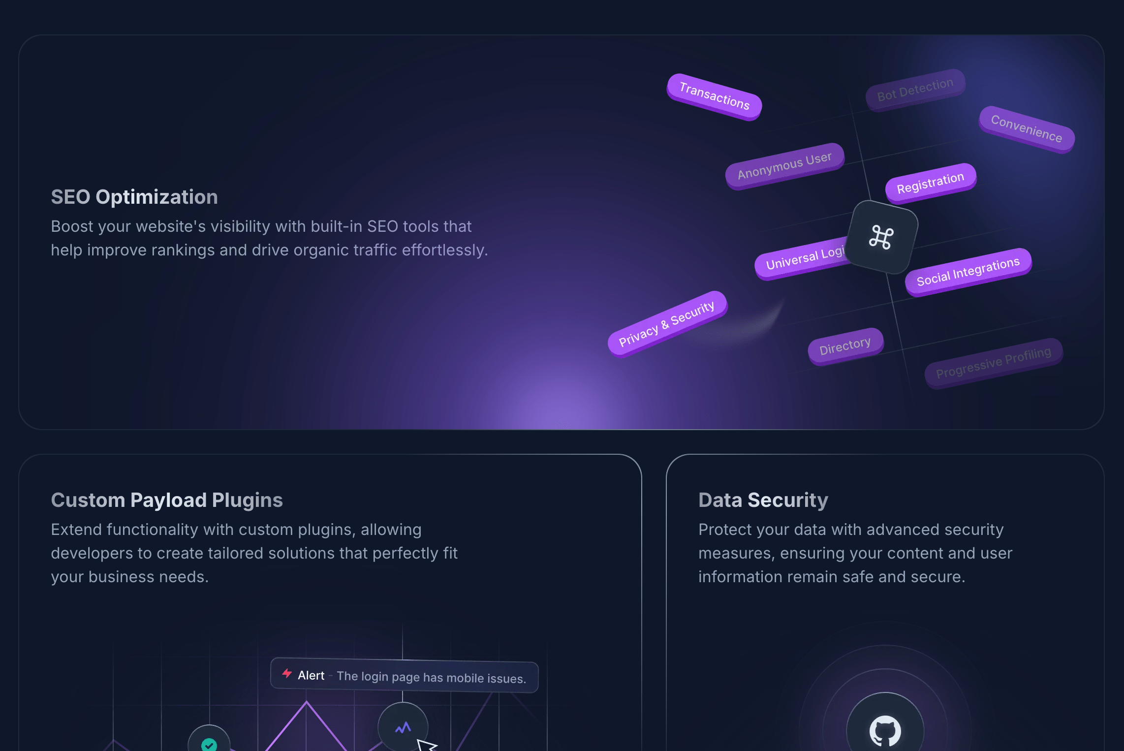
you can use both grid & flex layout together and create awesome stuff🔥
here is an another example of both grid & flex layout together👇
I’ll share learning resources also
And that’s it for this blog, thanks for making it till here, stay tuned peace✌️