5 Design principles i use to create website
Hi there👋, today i’ll explain the Design principles & tricks which i use to create website, so you can also build website which gives good browsing experience for your users.
A good design simplifies the development process
Use less colors
You can build entire website by just using these 3 colors, even my blog was build with same logic
- Brand color (use your brand-color for popup elements like buttons, links etc)
- Background color (choose between black or white, else lightest or darkest shade of your brand-color)
- Font color (choose the opposite color of your background color)
Less colors = more consistancy
Here are few tools to visualize you website with different colors & check the contrast ratio using
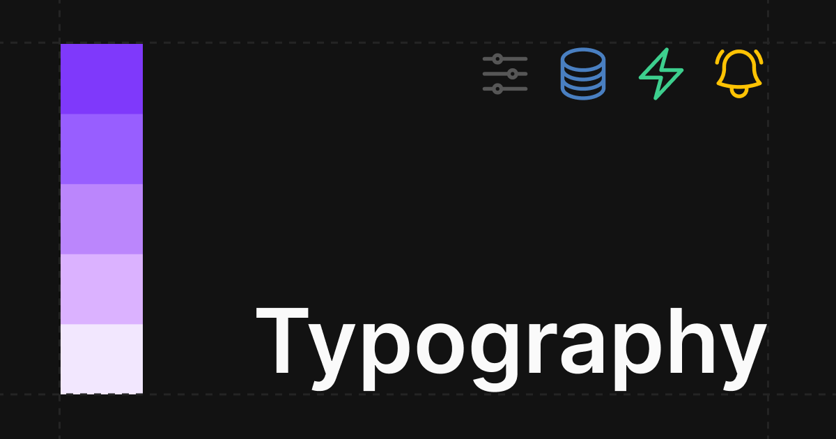
2 Typefaces
Generally we go crazy🤯 in this part using multiple font-families, but 2 font-families are enough for a website, their are 2 categories in this font-family:
- Display fonts (the font which is used for headings, highlighting, etc)
- Normal fonts (the font which is used for body text)
Even my blog website is build on 2 font families
Bonus
- Limit the sentence maximum width to 40 - 60 Characters to increase readability
- This is a niche case, check for readability of letter i,j some font-families generally don’t have difference between these letters
Single Icon Library
We can’t skip using icons in our website, in this process we’ll use icons from different providers, this can mess-up the website consistancy because we’ll use 2-3 different styles at once it’ll look odd
![]()
Maximum try to use single icon-library, here are few icon libraries i use the most
Visual Hierarchy with colors & sizes
You can change the importance of every element by using the colors & sizes, if you’ve 2 paragraphs you can change the importance of text just by adding gray color here is an example👇
Here i’ve made the heading bold & increased the font size so it grabs more attention, & next i’ve made the text gray to decrease it’s importance
In life we’ve limited amount of fucks, so choose them wisely
Everything doensn’t need user attention, with visual hierarchy you can create a path for user to navigate
Accessibility
The most underrated & igonered one, even i too skip this most of the times, a good design must be accessible for all, here are few common use cases
- Form auto-submission on-press of Enter key
- Accessing all actionable-items(example: Buttons, Links) with tab key
You can learn more on MDN Docs
That’s it for this blog, thanks for making it till here, my goal is one quality post per week. Stay tuned peace✌️